

Senseless Design Committee overreach on color dictates
The Design Manual already imposes the color choices decided by a small group of individuals who actually have no sound concept of “compatibility” with Sunriver’s natural environment, despite their claims.
Obviously, painting a house or other items in “dayglo orange” would be inharmonious with what you see when you look around the many hues of the land, the river, sky and wide variety of plants of all sizes and shapes in Sunriver.
But here is the fatal flaw in the basis for color rules that a handful of committee members have decided is “right” for Sunriver — that having fewer colors is better, and all these colors should be dull and bland.
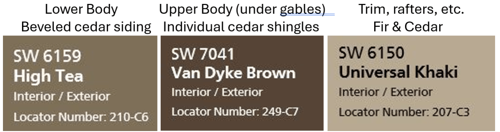
My wife and I chose the three colors that we used on the Sunriver home we built in 2014-25 by first collecting grass blades, pieces of Ponderosa bark, pine needles, and a few other samples from our lot. We then engaged a very highly educated and experienced, professional color expert who recommended a palette that would harmonize with the surroundings on our typical Sunriver lot.
With the vocal support of the General Manager at that time, we earned unanimous approval by the then Design Committee.
Thus, my jaw dropped when, standing in front of my house, the current Design Committee chair ungraciously criticized our house because it “drew too much attention to itself.”
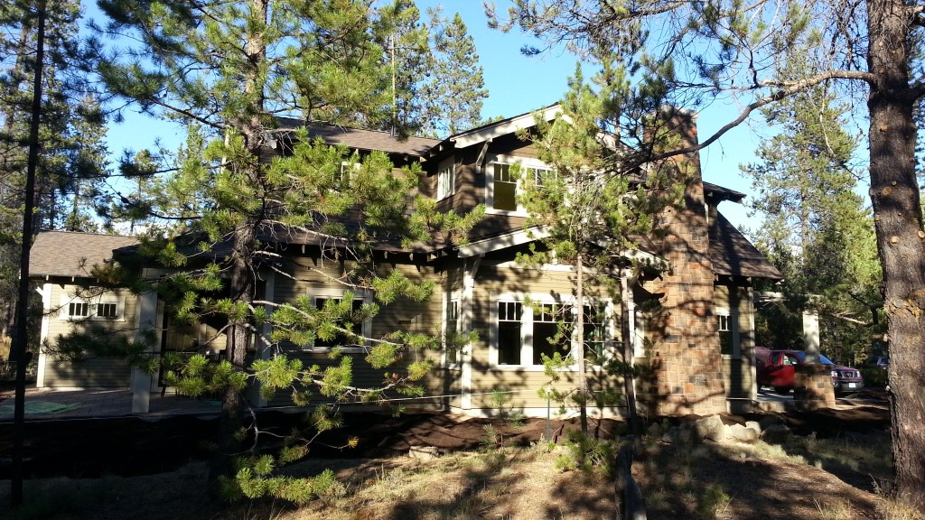
I imagine you can readily see how “inharmonious” our home is with the highly varied hues, saturation, and brightness of surrounding natural colors. You’re welcome to view our home at 8 McKenzie Lane and decide for yourself who had the better understanding of design harmony — our professional color consultant or the committee chair.
The sad fact is that no one on the current Design Committee actually is educated or has a valid intuition about “color harmony.” In their ignorance, the committee has imposed the worst possible concept, insisting that all the Sunriver houses should appear as a large, monolithic structures plopped down in the forest. That misguided approach actually does draw attention, and not in a good way at all.
The same individual also slammed the fact that we painted our corner boards the trim color (Universal Khaki), rather than the body color, again demonstrating lack of knowledge that classic Northwest Bungalows with beveled lap siding and corner boards (rather than mitered corners) almost universally use the trim color on the corner boards.
A COMPLETELY UNWORKABLE CRITERION FOR “COLOR CONTRAST.”
As bad as the current color criteria are in the current version of the Design Manual, the proposed amendments to the Design Manual would make them much worse. Let’s start with such badly written rules that there cannot have been any review or advice by an attorney or planner having the most basic understanding of clear and enforceable regulations.
There are nineteen instances where the criteria prohibit colors that are “excessively contrasting”, for example:
- Section 3.21.c.3 [Satellite dishes s]hall be compatible and not excessively contrasting to/with the siding color.
- 3.29.a.5 All pergola’s [sic], arbors and trellises architectural design shall be compatible and not excessively contrasting with the principal structure.
- Click here to view the entire list of sections with this criterion.
The obvious questions are:
- How is “contrast” measured?
- What is the objective threshold for “excessive” contrast?
- Who will make every decision that will be required for the multitude of elements that cannot have “exceedingly contrasting” colors.
There are several standards for measuring “contrast.” The gold standard for perceptual color difference is CIEDE2000 (ΔE₀₀). This standard measures:
- Hue difference
- Lightness difference
- Chroma (saturation) differences
- Human visual non-linearities
How this metric can be interpreted:
- ΔE < 1.0 → indistinguishable
- ΔE 1–2 → barely perceptible
- ΔE 2–5 → small but noticeable difference
- ΔE 5–10 → clearly different
- ΔE > 10 → strongly contrasting
An example of a Design Manual clear and objective criterion for limiting contrast:
“Trim color must not contrast from the approved body color by more than ΔE₀₀ 10.0.”
This criterion would be clear to owners, simple to enforce, and could not be abused by SROA enforcement staff or “gamed” by an owner.
NONSENSICAL COLOR REQUIREMENTS FOR SOME OBJECTS
New requirements the amendments would impose on driveways, walkways, arbors, trellises:
- Section 3.04.a.6 Driveway color(s) must comply with the Purpose & Intent as established in Section 1.01 of this Manual, at the sole discretion of the Design Committee.
- Section 3.05.a.7 Walkway color(s) must comply with the Purpose & Intent as established in Section 1.01 of this Manual, at the sole discretion of the Design Committee.
- Section 3.29.a.2 All pergolas, arbors and trellises shall be affixed to or abut the principal structure.
- Section 3.29.a.3 All pergolas, arbors and trellises shall be installed over the top of and in conjunction with either a deck or patio.
- Section 3.29.a.5 All pergola’.s[sic], arbors and trellises architectural design shall be compatible and not excessively contrasting with the principal structure.
[Note: the bold text is one of the proposed amendments.] - Section 3.31.a.2 Patio color(s) must comply with the Purpose and Intent as established in Section 1.01 of this Manual. [Note how this section lacks the “at the sole …” clause.]
- Sectio 3.32.a.4 Colors. Permanently affixed speakers shall be the same or closely match the color of the material on which they are mounted to.
Ignore the typos, bad grammar, and inconsistencies and note the ill-considered rules. The most absurd example is to require all trellises to be “affixed or abut the principal structure, while also being installed over the top of a deck or patio, and not “excessively contrasting” with the principal structure. This clearly excludes modest-sized, black metal, free-standing trellises for use in an owner’s landscape.
Section 1.01 has myriad aspirational statements, several of which “compete” with one another. Based on my experience with the current Design Committee chair’s rant about our untinted, concrete driveway, I wouldn’t be surprised if whoever decides “compliance” with Section 1.01. may find that the dull white color of ordinary concrete doesn’t comply, while at the same time accepting that dark black asphalt does comply.
And finally, a great example of the committee’s penchant for “over-specifying” is the restriction on the color of “affixed speakers.” Why in the world should the Design Committee limit owners’ choice of outdoor speakers to only those products that “closely match” a house color?
RECOMMENDATIONS
- Adopt a specific, appropriate criterion for “contrast,” based on industry standard(s).
- Remove all references to “trellises” from Section 3.
- Remove Section 3.04.a.6
- In general, “dial down” the scope, narrowness, and minutiae of many design restrictions, particularly with respect to colors. “Extreme” colors could clearly and simply be prohibited with just few recognized standards, like contrast and hue.
- There is no established need for “solutions in search of problems,” such as controlling the color of driveways and affixed speakers. Clear out this clutter.
- Finally, exercise the professionalism to craft rules with proper grammar and punctuation and consistent use of terms and phrases. Otherwise, the careless crafting just further demonstrates the ad hoc nature of the design rules.

Leave a comment